
|
|
|
|
|
|
Home Site Search Contact Us Subscribe
|
|
|
|
New Directions: Branding Spaces with Graphics - Hillier Environmental Graphics Studio
Cities and institutions like libraries and colleges are increasingly relying on environmental graphic design to brand and market themselves. by ArchNewsNow June 24, 2004 Branding, identity, donor recognition,
exhibit design, and interpretive graphics are all part of the environmental
graphic designers repertoire. Among the tools are industrial design to shape
three-dimensional signage; planning, to help develop stakeholder agreement on
project elements and implementation; and architecture, for the strategic
placement of signage so that all the pieces fit seamlessly together. Environmental graphic design helps
clients establish or enhance an identity, provides information to help people
“find their way,” and promotes a well-planned, organized, and friendly
environment. Hillier Architecture has been
retained for a broad array of projects, from wayfinding in cities like Miami
Beach, Dallas, and Jersey City, to branding for the new Princeton, New Jersey,
library, and signage for the University of Alaska in Anchorage. Hillier launched its environmental
studio about a decade ago to meet client demand to incorporate wayfinding in
their construction projects. The group works in concert with Hillier architects,
planners, and interior design teams to create distinctive graphics, respectful
of the existing architecture, and meet the functional requirements of
architectural programs. The practice also operates independently, while
maintaining access to many of the firm’s disciplines. “Successful
wayfinding programs need to do more than just direct people,” according to John
Bosio, SEGD, Hillier’s studio director. They should bolster and extend the
client’s brand, fit into the overall architectural context, and help make
visitors feel welcome and secure. These
were the objectives Miami Beach wanted to achieve when it turned to Hillier’s
studio for a wayfinding program. The city is a major tourist destination and a
leading tastemaker in art, architecture, and fashion, as well as nighttime
entertainment. So its signage and logo had to convey the upbeat tempo and style
of the area. But Florida’s road signage regulations are more staid than the
city’s. A compromise acceptable to all had to be struck. The
designers overcame many issues with the state by using three-dimensional
bent-back panels with a chic design tone that draws both drivers’ and
pedestrians’ attention from all street approaches – without being intrusive.
The signage panels are wrapped in fashionable, fresh-and-friendly,
lime-green-and-blue tones, and Art Deco lettering dovetails with the local
architecture. Signs are set on metallic poles shaped to signal the different
information they offer. Wayfinding
Kevin
Lynch, who pioneered environmental graphics, described the essence of
wayfinding in his 1960s urban study, Image of the City: “Just as this
printed page can be visually grasped as a related pattern of recognizable symbols,”
he wrote, so a successful city is “one whose districts or landmarks or pathways
are easily identifiable and are easily grouped.” The concept also serves as a
metaphor for signage programs in buildings and elsewhere. The
fast-paced growth of Dallas has made it the ninth largest city in the country.
It had already installed some signage to help the 12 million annual visitors,
as well as downtown workers and residents. But the city wanted to update the
system and, just as important, project a new image consistent with its 21st
century reality. Dallas today is one of Texas’ foremost commercial and cultural
Meccas – the once-suitable “romantic cowboy” image was very out of date. To help the Downtown Business District brand its identity
and keep up with the area’s expansion, the designers created a wayfinding
master plan for the local vehicular system. Following Lynch’s prescription,
they divided the core area into 10 easy-to-navigate districts, and linked them
with signage by preferred travel routes. Pegasus, the mythic flying horse, was
chosen as the logo – the winged creature is also the hallmark of a large neon
Mobil sign visible throughout downtown is very familiar, and many locals
identify with it. A strategic implementation plan setting schedules and the approval process for getting the master plan work done was also drawn. A signage standards manual was created for the city to develop signage that will help pedestrians decipher the downtown underground and skywalk system of corridors, buildings, garages, tunnels, and bridges. The signs will be used as a stand-alone system or as a compliment to existing signage programs. More than just well marked paths, the new designs will help visitors to Dallas find the pattern of “recognizable symbols” of Lynch’s successful city. Princeton Public Library Many
of the same wayfinding principles that describe successful cities also
influence how we relate to interior spaces. We form what Lynch called a mental picture
of the space we inhabit. Graphics can help transform that picture into a brand
to which we also relate emotionally and, when warranted, loyally. As
part of its competitive strategy, graphics are also being used to enhance the
library’s brand. For a logo, the graphic
designers had the word “Princeton” imprinted on a striking red background,
with the “o” extended to form a simple outline of a person reading a book. The
symbol spans the marketing platform: It is stamped on library cards (which
sport a bar code and a key chain), directional signage, the library’s web site
– and even on stationary, baseball hats, and T-shirts. To
contend successfully with their commercial counterparts, modern agoras require
competitive branding…and gift shop revenues. Founded
in 1966, Hillier Architecture
provides services in
architecture, interior architecture, historic preservation, urban design, and
graphic design from offices in New York, Princeton, Philadelphia, and
Washington DC. Recent projects include the GlaxoSmithKline World Headquarters
in London, modernization of the U.S. Supreme Court Building in Washington, DC,
the restoration of the St. Louis Public Library and the Bronx School for Law,
Government and Justice. Hillier
projects have won more than 250 design awards. Also featured in ArchNewsNow.com: Housing the Machine:
Co-generation Plants by Hillier |
(click on pictures to enlarge) 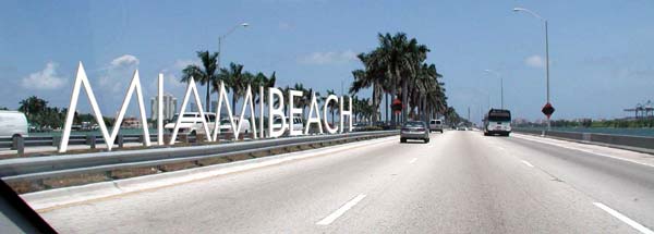 (Hillier) City of Miami Beach: Conceptual gateway signage would be a memorable, internationally recognized landmark visible from vehicles entering South Beach and cruise ships docking in the Port of Miami.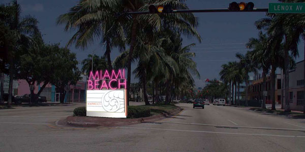 (Hillier) City of Miami Beach: conceptual gateway sign to South Beach; channel neon typeface is typical to the city (Hillier) City of Miami Beach: vehicular directional sign uses simple graphic layout to meet regulatory requirements - with form and style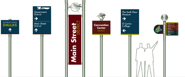 (Hillier) Dallas: directional signs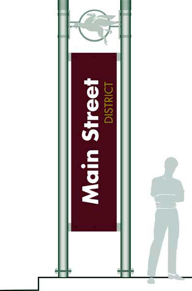 (Hillier) Downtown Dallas: signs incorporate Pegasus image based on iconic neon Mobil sign identified with the downtown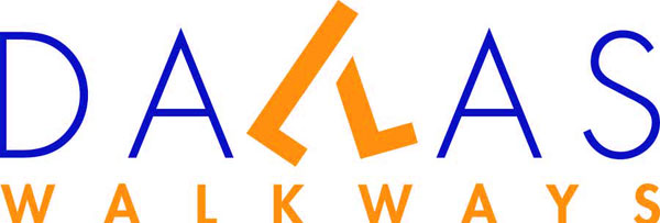 (Hillier) Downtown Dallas Walkways logo promotes pedestrian travel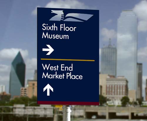 (Hillier) Downtown Dallas vehicular directional sign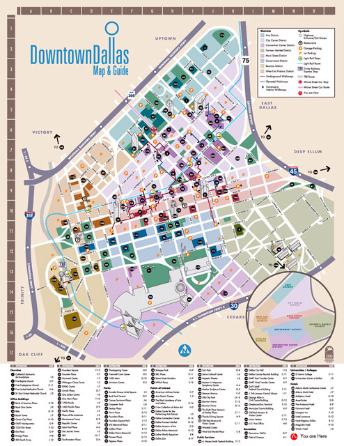 (Hillier) Dallas orientation map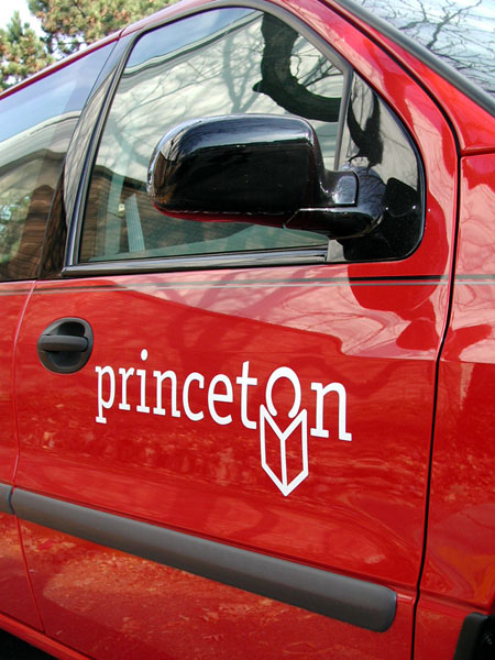 (Hillier) The Princeton Public Library logo dispels preconceived perceptions of traditional "Princeton" and any association with the university (Hillier) The library logo is used on a number of items as a marketing and promotional tool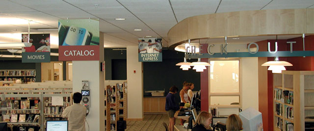 (Hillier) Princeton Public Library: Collection and Service identification creates a retail environment and promotes the library as a community gathering place.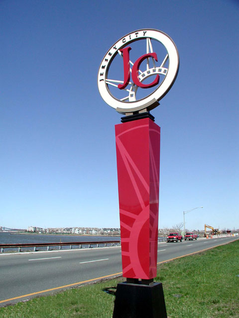 (Hillier) Jersey City, NJ: The Statue of Liberty is partially owned and serviced by Jersey City, so its crown is used as the primary element of the city's brand.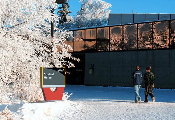 (Hillier) University of Alaska Anchorage: Building identification signs are designed with high contrast elements that make them standout in different environmental conditions. The dark panels are visible against high snowdrifts, and are illuminated during dark winter months; the yellow frames help the sign to standout among the lush green environment.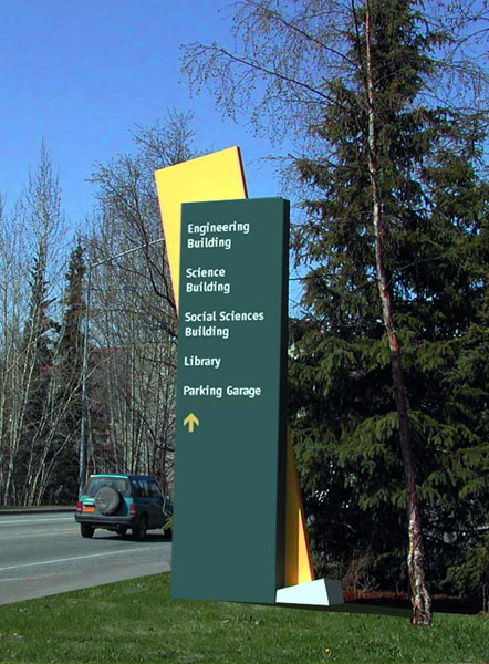 (Hillier) University of Alaska Anchorage: Colorful vehicular directional signs are influenced by the modern sculptures that dot the UAA campus - as well as Alaska's environmental conditions. |
© 2004 ArchNewsNow.com