
|

|
|
Home Site Search Contact Us Subscribe
|
|
A Filtered View #2: Ubiquitous Stuff - Why is Most of it so Ugly? Maybe Apple should design all of this stuff; or maybe Philippe Starck. By Charles F. Bloszies, FAIA November 12, 2015 Editor’s note: This is the second in a new series of musings by San Francisco-based architect Charles F. Bloszies, FAIA.
I miss Andy Rooney. He was a true curmudgeon. He would appear for a short satirical piece during 60 Minutes and begin by asking: “Did you ever wonder . . .” And then he would end with: “Now why is that?”
Well, as you walk by the myriad small scale objects that dot the streetscape, did you ever wonder why most of them are so unattractive? Many do serve a useful purpose: mailboxes, newspaper stands, fire hydrants, trash receptacles, parking meters, signs of all kinds, recycling bins, transit shelters, power poles, bike racks, all types of overhead wires, and so on. Some are necessary for public safety: stop lights, street lights, and more signs. Some for commerce: ATMs, advertising kiosks, and even more signs. All together, that’s a lot of visual stimulus.
Not that everywhere should look like a picturesque English country village, oozing tidiness and charm. In fact, when all of these objects are packed together, and signs are competing with each other for greater visibility, the result can be very exciting; think Times Square or Nanjing Road. But taken individually, one would think that these ever-present objects could be better designed.
It’s the same inside buildings: exit signs, fire alarms, smoke detectors, motion sensors, thermostats, and again more signs. Signs in elevator lobbies are often puzzling. Did you ever wonder why firefighters need so many instructions during an emergency – don’t they already know how to open the elevator doors?
Maybe Apple should design all of this stuff; or maybe Philippe Starck. Actually both have, directly or indirectly. You can find Starck’s street lights in many cities, including San Francisco. Nest Labs, started by folks who worked at Apple, has designed a really beautiful thermostat (it’s clever, too) and an attractive smoke detector. Maybe they will branch out and design a cool motion detector.
Europeans seem to be better at all of this. Take mailboxes, for example. Those round red British letterboxes – much better than ours. Even safety signs; exits in Italy are marked with a sign showing a person descending the stairway with a purpose. Some signs portending dangerous conditions are equally animated – probably more effective, too.
Did you ever wonder why so many of objects are so ugly? There certainly is an economic incentive to do better – they are all over the place. Perhaps good design really is difficult. Now why is that?
Charles F. Bloszies, FAIA, is an architect, structural engineer, and writer – and principal of a practice in San Francisco focused on complex urban infill projects. He is the author of Old Buildings, New Designs – Architectural Transformations, published in 2011 by Princeton Architectural Press and now in its third printing.
See also:
A Filtered View #1: Buckminster Fuller (Not Al Gore) Invented the Internet |
(click on pictures to enlarge)  Matthew Millman Photography A Filtered View 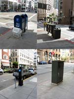 Visual clutter is everywhere  San Francisco’s seismic wave bus shelter  Philippe Starck’s streetlights  Nest Thermostat of the future here now  Mailboxes: U.K and Singapore 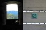 Signs in Italy |
© 2015 ArchNewsNow.com