
|

|
|
Home Site Search Contact Us Subscribe
|
|
|
Lost in Space: Calori & Vanden-Eynden on the Positive Payoffs of Integrated EGD Ever been lost in a building, feeling your stress level rise by the minute? If so, the lack of effective EGD - environmental graphic design - is very likely the culprit. By Claire Wilson January 10, 2014 All too often, architects, interior designers, and owners do not capitalize on the benefits of helping the users of their buildings – their customers – find their way around easily. Signage can be inadequate – too small or too sparse, incorrect information – resulting in quickened pulses, elevated blood pressure, or, at the very least, a late arrival to an important meeting.
“That stress is real and physical,” says Chris Calori, principal of Calori & Vanden-Eynden Design Consultants (C&VE) in New York. “It’s a very basic human emotion, the fear of being lost or the anxiety of being unsure. A sense of security is much more important than people might think.”
First impressions
For more than 30 years, Calori and her partner, David Vanden-Eynden, have been designing visual systems that keep everyone calm and carrying on. Among the earliest practitioners and one of the top firms in their field of Environmental Graphic Design (EGD), they devise strategic communications systems that help people navigate the built environment. Done properly, they can improve the appearance and functionality of a site and have an overwhelmingly positive effect on how people experience buildings, transportation facilities, an exhibition, or even a shopping trip.
“Signage is different from other aspects of a building or space in that people interact with it,” states Calori, whose firm has also done the graphics for the Ocean Financial Center tower in Singapore, and the University of Pennsylvania campus. “Unlike carpeting, or furniture, or the HVAC system, people read signs – they literally commune with them. They’re like a user’s manual for a building or space. And we all know what it’s like when we get a bad user’s manual!”
These first impressions are important because they influence people’s attitudes about the brand – or public image – of a building, space, or even a city, Calori says. Visitors’ impressions of a building can also be compromised if they can’t navigate it – they may leave and think twice about coming back. “It’s the same for cities,” Calori says. “If people feel anxious, economic development and tourism numbers can be affected, because people tend to leave rather than stay.”
Fresh signs put a Face on improvements
The pair used their expertise in bustling Hong Kong to help revitalize an aging 12-building office and retail portfolio owned by Hongkong Land Limited and spread over 20 blocks. To enhance architectural improvements, they used graphics to help visitors make their way around a system of 10 pedestrian bridges and to move easily among the buildings and between the complex’s interior and exterior. Signs clearly indicate connections to trains, subways, and the ferry to Kowloon – and also direct visitors to destinations beyond the owner’s buildings, adding value to their real estate by making the entire vicinity more user-friendly. “Being able to use the bridges and connections to more easily move about Central Hong Kong makes the property more desirable, escalating the complex’s return on investment,” Vanden-Eynden says. As a result, the older buildings have become more competitive with their newer, high-tech counterparts. Offices are thriving, and retailers and restaurateurs are profiting from those who now want to linger.
Two other systems the team devised had a similar effect, one in Washington, DC, and the other in the Upper Perkiomen Valley, a region in Eastern Pennsylvania that takes in parts of four counties. In DC, the district’s 24 million energetic tourists, most of them pedestrians, were the target for a district-wide wayfinding system. The resulting signs contain maps, transit, and historical information that help give out-of-towners a hassle-free visit. The program has since expanded to include signs for the Heritage Trails system and to designate historic districts. In the Upper Perkiomen Valley, the wayfinding system is primarily aimed at local residents, many of them driving cars, directing them to cultural attractions like the Knoll Museum, the Goschenhoppen Folklife Library, or recreational areas in the seven linked communities participating in the program. In this region and in DC, cultural attractions and businesses have benefitted from an increase in visitors.
The need remains the same
The field of EGD has been a recognized specialty for only about 40 years, with Calori and Vanden-Eynden on board as practitioners for almost that long. Calori is the author of Signage and Wayfinding Design: A Complete Guide to Creating Environmental Graphic Design Systems, which was recently published in Chinese and will be released next year in its second English-language edition. Calori’s authoritative book is an extraordinarily detailed volume on a field that has evolved non-stop since its beginning. The first milestone in its development was the realization of a need for planned signage as cities grew, transit systems spread, and airports and shopping malls expanded exponentially, according to Vanden-Eynden. “It became a matter of scale and a consistency of communication,” he says. “You could no longer simply just slap signs up in a haphazard manner.”
The second milestone was technology. Drawing boards gave way to computers, and with that, the kinds of graphics can be produced. From the limits of static, 2-dimensional signs created by hand have come changeable signs, talking signs, massive outdoor billboards, interactive information systems, and dynamic displays of every description. Plus, the whole fabrication process is highly automated, Calori notes. Despite these extraordinary changes, “the need remains the same,” says Vanden-Eynden. “Help me find my way.”
Transit systems around the world have embraced EGD with C&VE at the fore. The firm designed a system of appealing 3-D markers and 2-D signs for Amtrak’s Acela line, in cool blue and silver that says “sleek, speed, efficiency.” Coordinated information kiosks are being added throughout the Northeast rail corridor. The team is also collaborating on graphics for Manhattan’s Second Avenue subway currently under construction. “Transit system signage has to be top notch,” Vanden-Eynden says. “You can’t use the subway system without it.”
Get it right, right at the beginning
Whimsical sense-of-place signage is invaluable because it is recognizable and memorable, like the stacked Crate & Barrel boxes C&VE designed for the company’s Illinois corporate headquarters using its existing black-and-white logo. Likewise, the pride of place created by the illuminated Tribute Towers along Woodward Aveue in Detroit, which is priceless. Yet, some of the clients with whom C&VE work still view signage as a necessary evil. Graphic communication is not a part of their thought process or economic planning, so they end up ordering stock systems that coordinate with nothing and detract from the architecture.
The firm says that the key to changing this pattern is getting architects and owners to address the signage issue early on so the result is beautiful and integrated versus an afterthought. This was the case for the design of One Raffles Quay office tower complex in Singapore where C&VE was on board from the beginning. The result is a signage system that has continuity throughout the complex, and whose dramatic tone is set by impressive meter-high green glass letters at the entrance. “Working early with the design team we are able to develop sympathetic and complementary graphics and 3-D forms that express the spirit and personality of the building,” Calori says.
Mies van der Rohe once proclaimed that “God is in the details.” To C&VE, good signage is the singular detail that vitally contributes to the overall success of a project. “Simply stated,” Vanden-Eynden says, “it is the finishing touch.”
Claire Wilson writes for the New York Times and AIANY’s Oculus magazine.
Editor’s Note: Unrelated to this feature, Calori & Vanden-Eynden designed the graphic identity for ArchNewsNow.com .
|
(click on pictures to enlarge)  Tim Nolan New materials and lighting techniques add sparkle and color to the identification sign designed by Calori & Vanden-Eynden Design Consultants (C&VE) for the Ocean Financial Center in Singapore; architect: Pelli Clarke Pelli Architects. 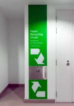 Tim Nolan Ocean Financial Center: Even the recycling station received the attention of C&VE.  Barney Taxel In Cleveland, Ohio, the Rock & Roll Hall of Fame and Museum’s identification sign confirms “I was here” in thousands of visitor photos; architect: Pei Cobb Freed & Partners.  Barney Taxel It’s not complicated! Fans and visitors rely on the simple directories to find the hallowed ground of the Rock & Roll Hall of Fame. 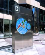 Hongkong Land Ltd. Hongkong Land Limited (HKL) – Connect 12: Maps showing the local vicinity as well as the surrounding district provide information about destinations in and about HKL’s buildings.  Hongkong Land Ltd. Hongkong Land Limited (HKL) – Connect 12: Inlaid characters and letters on pedestrian bridges keep people informed of their where abouts; architect: Kohn Pedersen Fox Associates/KPF.  Hongkong Land Ltd. By pointing the way to destinations outside of its portfolio of properties, Hongkong Land’s buildings become accessible and connected and makes them more desirable as a place to do business.  Calori & Vanden-Eynden Now available in a Chinese language version, Chris Calori’s book “Signage and Wayfinding Design: A Complete Guide to Creating Environmental Graphic Design Systems” confirms the firm’s influence on EGD, as well as it importance in an ever more connected global community.  Hochlander Davis Washington, DC’s pedestrian guide signs are part of one of the most successful urban wayfinding systems in the U.S. 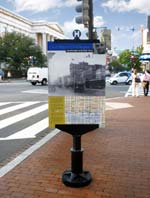 Calori & Vanden-Eynden History to go: The DC Heritage Trails sign program has been adopted to serve as the District’s official dispenser of historic information.  Calori & Vanden-Eynden Rendering of the basic components of the Upper Perkiomen Valley regional sign program in Pennsylvania.  Perkiomen Valley Chamber of Commerce Volunteers and students from the local career and technical high school were involved in producing prototypes for the Upper Perkiomen Valley sign program. 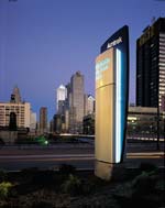 Elliott Kaufman Signage as brand builder: The streamlined qualities of the Acela trains are reflected in the branded sign forms and colors. 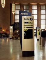 Elliott Kaufman Street to gate to platform: Acela signage helps make the entire rail riding experience more convenient, comfortable, and stress free.  Alan Shortall Crate & Barrel’s signature graphics identify the company’s headquarters in Northbrook, Illinois. 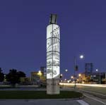 Curt Clayton Wordless story telling: The Tributes program tells stories of Detroit and Woodward Avenue in pictures. Each Tribute is created by a local artist or designer.  Calori & Vanden-Eynden Before the first Tribute tower was installed in Detroit, C&VE produced dozens of study models and explored numerous story lines.  Tim Nolan Art meets architecture: At One Raffles Quay, glass letters provide an icy cool counterpoint to steamy Singapore; architect: Kohn Pedersen Fox Associates/KPF. 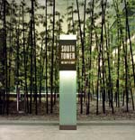 Tim Nolan Totem signs are three meters tall and identify the multiple entrances at One Raffles Quay in Singapore.  Elliott Kaufman The finishing touch: New wayfinding and identification signs at Rockefeller University in New York City are so integrated people believe they have been around for decades. |
© 2014 ArchNewsNow.com